There’s a version of luxury design that overwhelms, gold trim on everything, ornate detailing layered on top of ornate detailing, until the overall effect feels less like sophistication and more like excess. And then there’s a quieter, more disciplined version of luxury, one where a single well-placed accent does more work than an entire design covered in embellishment. Understanding the difference is the key to using gold effectively in business design.
The Fine Art of Subtle Luxury in Branding
Restraint is one of the hardest design principles to execute well, precisely because it requires knowing when to stop. Many businesses attempting a luxury aesthetic default to more, more color, more detail, more visible signals of quality, assuming that luxury is best communicated through abundance. In practice, the opposite is often true. The most convincing luxury branding tends to rely on a small number of carefully chosen details, deployed with confidence, rather than an accumulation of ornamentation that can start to feel try-hard rather than genuinely premium.
Gold, used correctly, exemplifies this principle well. A small amount of gold detailing against a clean, otherwise minimal background can read as considerably more luxurious than gold used liberally across a busier design. The contrast itself does much of the work, creating a moment of visual emphasis that a fully gold treatment would dilute.
Where Gold Accents Work Best
Gold detailing tends to work best when it highlights something specific, a name, a title, a key piece of contact information, rather than being applied as a general decorative element throughout a design. This is particularly effective in materials like gold lettering business cards, where the gold treatment draws the eye directly to the most important information on the card, reinforcing both legibility and a sense of quality in the same gesture.
This kind of targeted application also tends to age better than more decorative uses of gold. Trends in ornate design come and go, but a clean layout with a single, purposeful gold accent tends to feel timeless rather than tied to any particular design era, since the underlying principle, using a premium detail to draw attention to what matters most, doesn’t really go out of style.
Avoiding the “Too Much” Trap
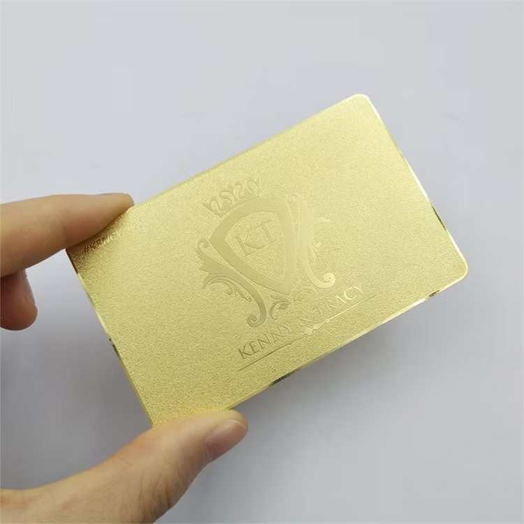
The line between elegant and excessive with gold detailing is thinner than it might seem. A useful test is to ask whether the gold accent is doing a specific job, drawing attention to a name, a logo, a key detail, or whether it’s simply present because gold feels luxurious in the abstract. The former tends to read as intentional and refined. The latter often reads as decoration for its own sake, which can undercut the very sense of sophistication it’s meant to convey.
Color and material context matter here too. Gold tends to read as most elegant against clean, neutral backgrounds, black, white, deep charcoal, where the contrast is strong and the gold has room to stand out. Layering gold against busy patterns, bright competing colors, or other metallic finishes tends to muddy the effect, making the overall design feel cluttered rather than premium.
Pairing Gold with Modern, Minimalist Design
Some of the most effective contemporary uses of gold detailing lean into minimalism rather than traditional, ornate luxury aesthetics. Clean sans-serif typography paired with a single gold accent, generous white space, and a restrained color palette can feel distinctly modern while still carrying the premium associations that gold has always brought to design. This pairing avoids the dated feel that more heavily ornamented gold treatments can sometimes carry, while still delivering the same underlying sense of quality and attention to detail.
This approach also tends to be more versatile across industries. A minimalist design with a single gold accent can work equally well for a financial services firm, a boutique creative agency, or a luxury real estate brand, adapting to different brand personalities without needing a fundamentally different design language.
Less, Done Well
Gold accents remain one of the most effective tools in a designer’s toolkit for signaling quality and sophistication, but only when used with genuine restraint. The goal isn’t to maximize the presence of gold in a design, but to use it deliberately, in service of drawing attention to what actually matters. Done well, a small, well-placed gold detail can communicate more luxury than an entire design saturated in ornamentation ever could.